Why Monkey?
If we’re sticking to the merits of ADDIE, or at least considering that it’s got merit, it only makes sense to take the “E” pretty seriously.
By evaluating our instructional designs at every stage, we can continue not only to improve them, but also to ensure that they are meeting the needs of our students and schools.

To effectively evaluate any instructional design, it is necessary to choose the right tools. It makes sense to analyze evaluation tools and consider how they may or may not provide the information sought at any given stage of the instructional design process.
In this case, I focused on an evaluation tool that might be able to provide me with good information about users’ experiences with the technology-based curriculum I’m currently developing.
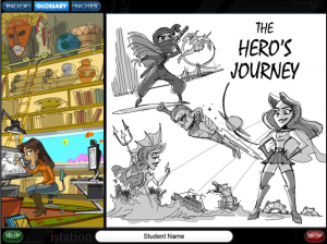 As the first segment of the program hits production and is released, I’m interested in obtaining user feedback. I want to know what students, teachers, and administrators think about several specific components of the program, a piece of Istation Reading called Timeless Tales with Paige Turner.
Historically, my company hasn’t invested extensively in field testing and/or this type of evaluation. So I also wanted to know how much bang we could get for our buck.
Enter Survey Monkey.
Website Props
This review isn’t technically supposed to focus on Survey Monkey’s website, but the marketing and sales professional I was in a former life compels me to give it a mention.
Immediately upon arriving at Survey Monkey’s site, I was greeted with the answers to my biggest questions, and in a friendly, easy-to-manage format. I understood what Survey Monkey was, saw at least five potential industries/arenas for its use, and could have signed up instantly.
From the first page, I learned that I could design surveys, collect the results, and analyze the data. I learned that these surveys could be used for market research, education, customer satisfaction, nonprofits, and human resources.
There were also hints to extra features like targeting a specific audience, and a few links at the top just in case I wanted to learn more, which I did.
Nice work, Survey Monkey!
Uses & Features
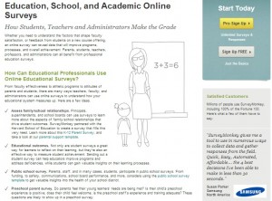
Because I’m most interested in using Survey Monkey for evaluating user attitudes and the overall effectiveness of a technology-based program designed for middle school students, the first link I clicked took me to Survey Monkey’s education page.
Here, I learned about several different uses for surveys in education, which definitely piqued my interest and gave me some good ideas.
I also noted the customer testimonial from a Samsung professional, and again, my inner marketing professional couldn’t help but give kudos to Survey Monkey’s web designers. Nice touch.
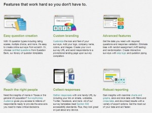
Next, I went back to home and clicked on the “How it Works” link. There, I discovered a pretty nice set of features offered by Survey Monkey, though I suspected they couldn’t all possibly come with the free edition. I was right.
A quick glance at the features page, and my wheels were already turning. We can brand these surveys with our company logo? Target audiences for specific purposes? Get reports to help us analyze the data obtained from the surveys?
Of course, my next question was, “So, how much does all of this cost?”
I learned more as I ventured further into the website. The plans and pricing structures are clearly outlined via one of the homepage links. There, I learned that custom-branded surveys cost upwards of $700 per year. That’s the fanciest plan. Other plans offer various feature packages at various price points.
The free version offers ten questions and a hundred responses per survey and a host of web-based tools. I signed up for free and went from there.
Getting Started
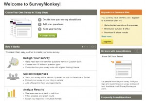
Once I created my account, I was greeted with a welcome page. To the right was an opportunity to upgrade. I did not.
The create-a-survey page offers tips and various levels of support.
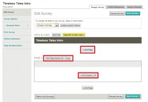
When I clicked on the button to create a survey, I was then directed to a new page where I had opportunities to customize my survey, add questions and pages, create headers and titles, and more. The navigation and tools here were intuitive and clear, for the most part.
I got started right away, creating a general survey designed for teachers and administrators, which I hoped could provide insight into their first impressions of the Timeless Tales program.
A Few Bumps
Right away, I was faced with my first problem. I’m a visual person, and I like to have control over the visual design of anything I do or publish.
I love WordPress because I get to pick the themes, colors, and layout for my blog. I have enough control, and enough basic HTML knowledge, to be able to tweak the overall look and feel of my blog at will.
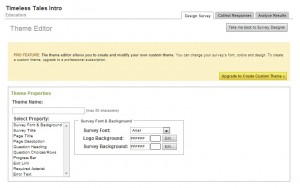
Of course, before I started building content for my survey, I wanted to play with the look of it. It didn’t take long before I realized that I wouldn’t be able to create a survey with red accents to match the Istation branding and logo, because red wasn’t available as a ready-made template. To customize a theme, I’d have to upgrade to the pricey “PRO” package.
Unfortunately, this information was conveyed via a banner at the top of the customized theme page, which didn’t prevent me from spending time attempting to customize my survey’s appearance.
I fiddled with colors, fonts, and layout a little, and then realized I’d have to upgrade to save my changes. This was disappointing.
I also considered whether I wanted to generate questions from scratch or take advantage of the various template surveys available. I clicked on the option to create an “Education” template survey.
However, as I browsed, I realized that of the twenty-one education-related surveys available, only five of them are available to users with free accounts. If I wanted to take advantage of the other sixteen templates, I’d have to upgrade to PRO.
Monkeying Through the Bumps
 At this point, I decided to create my own, fairly generic-looking survey using the Survey Monkey “Question Bank” as a resource. The site claims that the question bank contains thousands of “certified” questions and also claims that these questions are worded in such a way as to eliminate bias and generate usable results.
Because my survey is very particular, I couldn’t just click to grab the stock questions, but I did find perusing them helpful in generating my own questions.
I liked the question generation tool and found it very easy to use. I liked that it offered many types of questions and allowed for editing, even once the questions had been generated. I liked that there were multiple-choice questions, ranking questions, open-ended questions, and more to choose from.
Between perusing the question bank and playing around with multiple question types, I felt I could easily create an objective survey with relative ease.
My Survey
In the end, I ended up with a Timeless Tales Intro and Lesson 1.1A survey which I think I can present to the higher-ups as an example of the kind of information we could gather from a full-scale field study.
I’d like to send it off to several of my teacher friends, along with access to the initial release of Timeless Tales, currently hosted on our development server, and see what they think.
I’m certainly not going to shell out $780 for the PRO version of Survey Monkey, but I might be able to convince my company to do it. I think the tools available might be worth the cost. I’ll have to research a little deeper if I want to build a solid argument for Survey Monkey as a viable business tool.
In the meantime, I’m reasonably satisfied with what I was able to accomplish with my free account.
I can see potential for internal use, too. I could send a survey to the members of our Istation Education Committee, who review and comment on each piece of the program as it is released.
With such a survey tool in place, I might be able to help control their feedback, help keep the committee’s feedback productive and useful, help keep our focus targeted.
Conclusions
I feel that surveys like this can not only help instructional designers when we receive the feedback, but can also prove useful in their very generation. By deciding on the types of questions to ask, we are also articulating what exactly we want to know.
In short, asking the right questions of our instructional designs can be just as critical a step toward successful evaluation as collecting and analyzing the answers to those questions.
And that’s an outcome worth monkeying around for!
References
Austin, I. (2011). Instructional Design Basics – ADDIE Analysis. Retrieved from digitizedi.com: http://www.youtube.com/watch?v=_l7Y2jVGoIc&list=UUcIEy4X4RvXJu92QIuGto7A&index=6&feature=plcp
Churches, A. (2009). Bloom’s Digital Taxonomy: It’s not about the tools. It’s about using the tools to facilitate learning. http://edorigami.wikispaces.com.
Istation. (2012, June). Istation Reading. Retrieved September 3, 2012, from Istation: http://www.istation.com/Curriculum/ReadingProgram
ISU College of Education. (2012). ADDIE: Evaluate. Retrieved from Idaho State University College of Education, College of Science, Math, and Technology Education: http://ed.isu.edu/addie/evaluate/evaluate.html
Jackson, A. G. (2009). Curriculum Integration: The Use of Technology to Support Learning. Journal of College Teaching & Learning, 71-78.
Malamed, C. (2012). When Your Content Resembles Spaghetti. Retrieved from The eLearning Coach: http://theelearningcoach.com/elearning_design/instructional-analysis-for-procedure/
McDonald, J., & Gibbons, A. (June 2009). Technology I, II, and III: criteria for understanding and improving the practice of instructional technology. Educational Technolgoy Research & Develoment, 377-392.

