Category Archives: Bulletin Board

Your Story Matters

As a single mom balancing a career and grad school, I’m not sure what I’d do if my coursework at Post University didn’t cleanly align with my work as an instructional designer at Istation.

I’ve been working on Timeless Tales with Paige Turner, an online reading intervention for struggling middle school students, about as long as I’ve been studying instructional design and technology at Post. My coursework has guided the design of the curriculum I’m building all along. It’s kind of a beautiful thing.

In the world of education, we often talk about how students need to be able to apply what they’ve learned in the most authentic setting possible in order to gain a deep understanding, to generalize and internalize their new knowledge. In my case, as a student, that’s exactly what I get to do.

In the Beginning

As I initially developed the broad themes and content for the curriculum, I took classes about the general state of education and the growing implications of technology in education. I took classes about the population of students currently working their way through the system. I studied the processes of the brain, measured and analyzed data, and immersed myself in research about how humans learn.

I studied standardized test scores, data about poverty and its impact on student success, and research about how the 21st century student thinks and functions differently than the 19th or 20th century student did.

I learned how technology is impacting our global economy, and discussed with my colleagues the myriad ways new trends in technology will likely impact the types of skills that today’s students will need in the future.

As I was learning these things, I designed the scope of the program to align with who its users would be. I thought about content that would get the attention of a would-be dropout. I thought about the social media world and how we might leverage it to build opportunities for collaboration. I thought about the English Language Learners making their way through America’s school system today and designed language supports to meet their needs.

Every new piece of information I devoured was deliberately applied to the overall design of Timeless Tales.

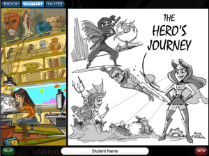
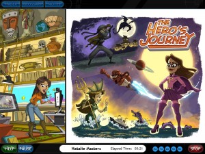
During my first year at Post, most of my work at Istation was theoretical, in that I was mapping out the path students would take through the program. I studied the state assessments to pinpoint the skills they’d need in order to graduate. Then, I planted these skills in the context of the overreaching theme of the hero’s journey and the power of storytelling to shape and impact human history.

I wanted the program itself to tell a story. I wanted to give struggling and demotivated teenagers a reason to master the skills the education system deems critical for their success.

But more than that, I wanted to empower them. Our world needs problem-solvers. We need innovative thinkers who can create solutions.

Timeless Tales is a reading program. But the value of being able to read and comprehend texts does not end at the edges of the academic world. Reading really is power. Mastery of reading is synonymous with mastery of the new world.

History shows that a lack of access to information can cripple entire populations.

We’ve got a dropout problem in the U.S., and if these kids can’t read by the time they leave school, they are at a grave disadvantage.

The information highway is perhaps the most empowering technological advance ever devised. If you want to know something, all you have to do is get online and read about it. It really is that simple.

But even further, if you want to transform knowledge into a vehicle for change, you’ve also got to be able to think critically about what you read, to analyze and synthesize information, to use what you know to create something new.

As a curriculum designer, I wanted to shape a virtual experience that could help empower these students. I wanted them to know that they can tell their own stories, shape their own futures, and use the skills and talents they have to make the world better. And I wanted to give them access to the tremendous wealth of knowledge available today.

From Theory to Practice

As I moved on to the upper level courses focused on leveraging technology tools for instructional design, the production of Timeless Tales started to take off. We moved from the high-level goals, the analysis of needs, and the design phases into the nitty gritty of development and production.

The first 600-level course I took focused on the ADDIE design model. I don’t think that ADDIE is necessarily the end-all, be-all of instructional design, but working my way through it enabled me to create legitimate design documents that helped bring my vision for Timeless Tales into reality.


I was able to follow a process to communicate my vision to the entire production team, and I was able to use documentation of my research to justify the program’s layout to our educational consultants and upper management teams.

So I’ve got goal. I’ve got a map. I’ve got buy-in. Now, what does it LOOK like?

That’s where my current course on the integration of technology into teaching and learning comes in. With a focus on authentic and motivating learning experiences, we’ve delved into technological tools and lesson designs that can deeply enrich a curriculum like Timeless Tales.

Seven weeks ago, I began this course. In seven weeks, we’ve organized a game-based learning team to brainstorm ways to translate educational objectives into fun and engaging games that accurately measure student success. We’ve scrapped standardized, multiple-choice style assessments in several areas of the program.

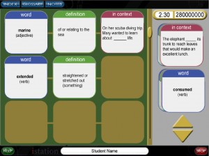
Last week, one of our engineers sent me fifty ideas for game-based learning experiences. A brand-new programmer designed three vocabulary activities around the idea that students should have high-level conceptual understanding of words as well as the skill of being able to plug those words into appropriate contexts and sentences.

Our lead engineer designed an infrastructure wherein students will be able to annotate texts, share their annotations with others in the program, and refer back to them anytime.

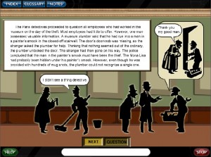
Our creative director has mapped out three different role-playing scenarios to replace three learning activities that consisted of students’ reading a passage and then answering some questions.


We’ve generated new content, new stories to tell. We’re writing about real-life heroes solving real-life problems. We’ve created a library of texts written on a level that a struggling reader can actually access and understand, and we’ve created choice-based incentives for them to explore the richness of the new content we offer.


In short, what I’ve learned in this course has directly impacted the development of Timeless Tales. We’re on a renewed mission to innovate, and every step we take remains aligned with our ultimate goal – to create a positive and empowering reading experience for a kid who may not even care anymore.

We’re trying to tell a really important story – the story of people and what they can do to shape the future. And we’re working really hard at designing Timeless Tales to engage students with a variety of technological tools.

Everything we build is built to communicate, “You can do this. You can read. You can think. You can analyze. You can create. And what you create matters, because just like every other story that’s ever been told, your story matters, too, kid.”


References

Churches, A. (2009). Bloom’s Digital Taxonomy: It’s not about the tools. It’s about using the tools to facilitate learning. http://edorigami.wikispaces.com.

Clark, D. (2011, September 26). ADDIE. Retrieved from Big Dog and Little Dog’s Performance Juxtaposition: http://www.nwlink.com/~donclark/history_isd/addie.html

Culatta, R. (2011). Instructional Design. Retrieved August 30, 2012, from ADDIE Model: http://www.instructionaldesign.org/models/addie.html

Hodell, C. (2011). ISD From the Ground Up: A No-Nonsense Approach to Instructional Design. Chelsea, MI: Sheridan Books, Inc.

Istation. (2012, June). Istation Reading. Retrieved September 3, 2012, from Istation: http://www.istation.com/Curriculum/ReadingProgram

Moore, D. L. (n.d.). Why Vocabulary Instruction Matters. Best Practices in Secondary Education.

Sincero, S. M. (2011). Cognitive Learning Theory. Retrieved from Experiment Resources: http://www.experiment-resources.com/cognitive-learning-theory.html

Tapscott, D. (2008). grown up digital. McGraw Hill.

Thagard, P. (2005). Mind: Introduction to Cognitive Science (2nd ed.). Cambridge: Massachusetts Institute of Technology (MIT).

Toshalis, E., & Nakkula, M. J. (September 2012). Motivation, Engagement, and Student Voice. Education Digest, 78(1), 29-35.

Zirbel, E. (n.d.). Teaching to Promote Deep Understanding and Instigate Conceptual Change. Tufts University.
 

Survey Monkeying Around

Why Monkey?

If we’re sticking to the merits of ADDIE, or at least considering that it’s got merit, it only makes sense to take the “E” pretty seriously.

By evaluating our instructional designs at every stage, we can continue not only to improve them, but also to ensure that they are meeting the needs of our students and schools.

To effectively evaluate any instructional design, it is necessary to choose the right tools. It makes sense to analyze evaluation tools and consider how they may or may not provide the information sought at any given stage of the instructional design process.

In this case, I focused on an evaluation tool that might be able to provide me with good information about users’ experiences with the technology-based curriculum I’m currently developing.

As the first segment of the program hits production and is released, I’m interested in obtaining user feedback. I want to know what students, teachers, and administrators think about several specific components of the program, a piece of Istation Reading called Timeless Tales with Paige Turner.


Historically, my company hasn’t invested extensively in field testing and/or this type of evaluation. So I also wanted to know how much bang we could get for our buck.

Enter Survey Monkey.

Website Props

This review isn’t technically supposed to focus on Survey Monkey’s website, but the marketing and sales professional I was in a former life compels me to give it a mention.

Immediately upon arriving at Survey Monkey’s site, I was greeted with the answers to my biggest questions, and in a friendly, easy-to-manage format. I understood what Survey Monkey was, saw at least five potential industries/arenas for its use, and could have signed up instantly.

From the first page, I learned that I could design surveys, collect the results, and analyze the data. I learned that these surveys could be used for market research, education, customer satisfaction, nonprofits, and human resources.

There were also hints to extra features like targeting a specific audience, and a few links at the top just in case I wanted to learn more, which I did.

Nice work, Survey Monkey!

Uses & Features

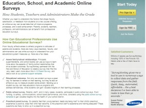
Because I’m most interested in using Survey Monkey for evaluating user attitudes and the overall effectiveness of a technology-based program designed for middle school students, the first link I clicked took me to Survey Monkey’s education page.

Here, I learned about several different uses for surveys in education, which definitely piqued my interest and gave me some good ideas.

I also noted the customer testimonial from a Samsung professional, and again, my inner marketing professional couldn’t help but give kudos to Survey Monkey’s web designers. Nice touch.

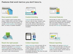
Next, I went back to home and clicked on the “How it Works” link. There, I discovered a pretty nice set of features offered by Survey Monkey, though I suspected they couldn’t all possibly come with the free edition. I was right.

A quick glance at the features page, and my wheels were already turning. We can brand these surveys with our company logo? Target audiences for specific purposes? Get reports to help us analyze the data obtained from the surveys?

Of course, my next question was, “So, how much does all of this cost?”

I learned more as I ventured further into the website. The plans and pricing structures are clearly outlined via one of the homepage links. There, I learned that custom-branded surveys cost upwards of $700 per year. That’s the fanciest plan. Other plans offer various feature packages at various price points.

The free version offers ten questions and a hundred responses per survey and a host of web-based tools. I signed up for free and went from there.

Getting Started

Once I created my account, I was greeted with a welcome page. To the right was an opportunity to upgrade. I did not.

The create-a-survey page offers tips and various levels of support.

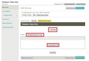
When I clicked on the button to create a survey, I was then directed to a new page where I had opportunities to customize my survey, add questions and pages, create headers and titles, and more. The navigation and tools here were intuitive and clear, for the most part.

I got started right away, creating a general survey designed for teachers and administrators, which I hoped could provide insight into their first impressions of the Timeless Tales program.

A Few Bumps

Right away, I was faced with my first problem. I’m a visual person, and I like to have control over the visual design of anything I do or publish.

I love WordPress because I get to pick the themes, colors, and layout for my blog. I have enough control, and enough basic HTML knowledge, to be able to tweak the overall look and feel of my blog at will.

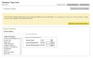
Of course, before I started building content for my survey, I wanted to play with the look of it. It didn’t take long before I realized that I wouldn’t be able to create a survey with red accents to match the Istation branding and logo, because red wasn’t available as a ready-made template. To customize a theme, I’d have to upgrade to the pricey “PRO” package.

Unfortunately, this information was conveyed via a banner at the top of the customized theme page, which didn’t prevent me from spending time attempting to customize my survey’s appearance.

I fiddled with colors, fonts, and layout a little, and then realized I’d have to upgrade to save my changes. This was disappointing.

I also considered whether I wanted to generate questions from scratch or take advantage of the various template surveys available. I clicked on the option to create an “Education” template survey.

However, as I browsed, I realized that of the twenty-one education-related surveys available, only five of them are available to users with free accounts. If I wanted to take advantage of the other sixteen templates, I’d have to upgrade to PRO.

Monkeying Through the Bumps

At this point, I decided to create my own, fairly generic-looking survey using the Survey Monkey “Question Bank” as a resource. The site claims that the question bank contains thousands of “certified” questions and also claims that these questions are worded in such a way as to eliminate bias and generate usable results.

Because my survey is very particular, I couldn’t just click to grab the stock questions, but I did find perusing them helpful in generating my own questions.

I liked the question generation tool and found it very easy to use. I liked that it offered many types of questions and allowed for editing, even once the questions had been generated. I liked that there were multiple-choice questions, ranking questions, open-ended questions, and more to choose from.

Between perusing the question bank and playing around with multiple question types, I felt I could easily create an objective survey with relative ease.

My Survey

In the end, I ended up with a Timeless Tales Intro and Lesson 1.1A survey which I think I can present to the higher-ups as an example of the kind of information we could gather from a full-scale field study.

I’d like to send it off to several of my teacher friends, along with access to the initial release of Timeless Tales, currently hosted on our development server, and see what they think.

I’m certainly not going to shell out $780 for the PRO version of Survey Monkey, but I might be able to convince my company to do it. I think the tools available might be worth the cost. I’ll have to research a little deeper if I want to build a solid argument for Survey Monkey as a viable business tool.

In the meantime, I’m reasonably satisfied with what I was able to accomplish with my free account.

I can see potential for internal use, too. I could send a survey to the members of our Istation Education Committee, who review and comment on each piece of the program as it is released.

With such a survey tool in place, I might be able to help control their feedback, help keep the committee’s feedback productive and useful, help keep our focus targeted.

Conclusions

I feel that surveys like this can not only help instructional designers when we receive the feedback, but can also prove useful in their very generation. By deciding on the types of questions to ask, we are also articulating what exactly we want to know.

In short, asking the right questions of our instructional designs can be just as critical a step toward successful evaluation as collecting and analyzing the answers to those questions.

And that’s an outcome worth monkeying around for!


References

Austin, I. (2011). Instructional Design Basics – ADDIE Analysis. Retrieved from digitizedi.com: http://www.youtube.com/watch?v=_l7Y2jVGoIc&list=UUcIEy4X4RvXJu92QIuGto7A&index=6&feature=plcp

Churches, A. (2009). Bloom’s Digital Taxonomy: It’s not about the tools. It’s about using the tools to facilitate learning. http://edorigami.wikispaces.com.

Istation. (2012, June). Istation Reading. Retrieved September 3, 2012, from Istation: http://www.istation.com/Curriculum/ReadingProgram

ISU College of Education. (2012). ADDIE: Evaluate. Retrieved from Idaho State University College of Education, College of Science, Math, and Technology Education: http://ed.isu.edu/addie/evaluate/evaluate.html

Jackson, A. G. (2009). Curriculum Integration: The Use of Technology to Support Learning. Journal of College Teaching & Learning, 71-78.

Malamed, C. (2012). When Your Content Resembles Spaghetti. Retrieved from The eLearning Coach: http://theelearningcoach.com/elearning_design/instructional-analysis-for-procedure/

McDonald, J., & Gibbons, A. (June 2009). Technology I, II, and III: criteria for understanding and improving the practice of instructional technology. Educational Technolgoy Research & Develoment, 377-392.

Moodle Noodle

Well, this week I explored Moodle for the first time. I felt like a pro through the first part of the process, installation.

And then things got hairy…


I started getting error messages like these every time I tried to log into my site:

Oh, the frustration!!!


Just LET ME LOG IN!!!

It seemed that no matter how many open programs I closed, how many different avenues I took to get into my Moodle system admin role, or how many times I restarted my computer, these blasted errors were here to stay. In my frustration, trying to balance life, work, home, parenting, grocery shopping, and play dates, I skimmed and scanned the forums and missed my instructor’s advice to contact my domain host tech support.

I tried and tried again, and yet I continued to fail… Meanwhile, my colleagues were posting all these really neat screenshots of their explorations of Moodle, learning about all these features, and really starting to make things happen.

Still, my life online looked like this:

The horror was, well, horrible.

Finally, after spending most of the day watching my 23-year-old sister who has autism and trying unsuccessfully for hours and hours to get into my site, I decided to give it one last go this evening. What do you know? I was in!

I had been lucky enough to get a couple of hours on Moodle before the server errors kicked me out earlier in the week, so I quickly set to building and exploring. I scrolled through some of my colleagues’ posts, checked out their screenshots, and tried to absorb as much as I possibly could in record time.

It may not look like much to you, but my ability to insert these four features into my Moodle Sandbox demo course this evening gave me the most spectacular array of nerdy emotions. I ran the gamut.

Mostly, I was humbled. Over these past few weeks, I had been feeling PRETTY SMUG about my ability to quickly build, customize, and polish my new online presence. I felt like a genius when I figured out how to edit code to change the colors on my website. I felt like a pro when I learned how to embed images and videos into my posts, and even to edit their dimensions to suit my ideal layout.

 ~~~

This server error business is still a mystery to me. One thing is certain: I will never, ever, ever assume that a totally unfamiliar technology is going to work perfectly for me just because I want it to. Never again.

But here’s the thing. I can’t forget the overreaching theme and mission of this site, even in a tech rant like this. We are here to LEARN. The awesome thing about technology is that I already know that within just a few days or weeks, or maybe months at most, I’ll have this Moodle thing down pat. I’ll be building an online classroom where we can connect and share our knowledge, and it will not only function, it will function elegantly.

That’s the beauty of open source, user manuals, and a philosophy on life that goes something like this:

Try. Try again.

And just in case you, too, have suffered through your first encounter with a powerful new technology anytime recently, here are a few resources to whet your whistle and rebuild your faith that technology can indeed be harnessed for the common good.


The World of Moodle

The Mohnkern Learning Center — Powered by Moodle

Transitioning to PolyLearn (Moodle)